iOS • Android • Mobile Products & BASE UX
Article Page Redesign
iOS • Android • Mobile Products & BASE UX
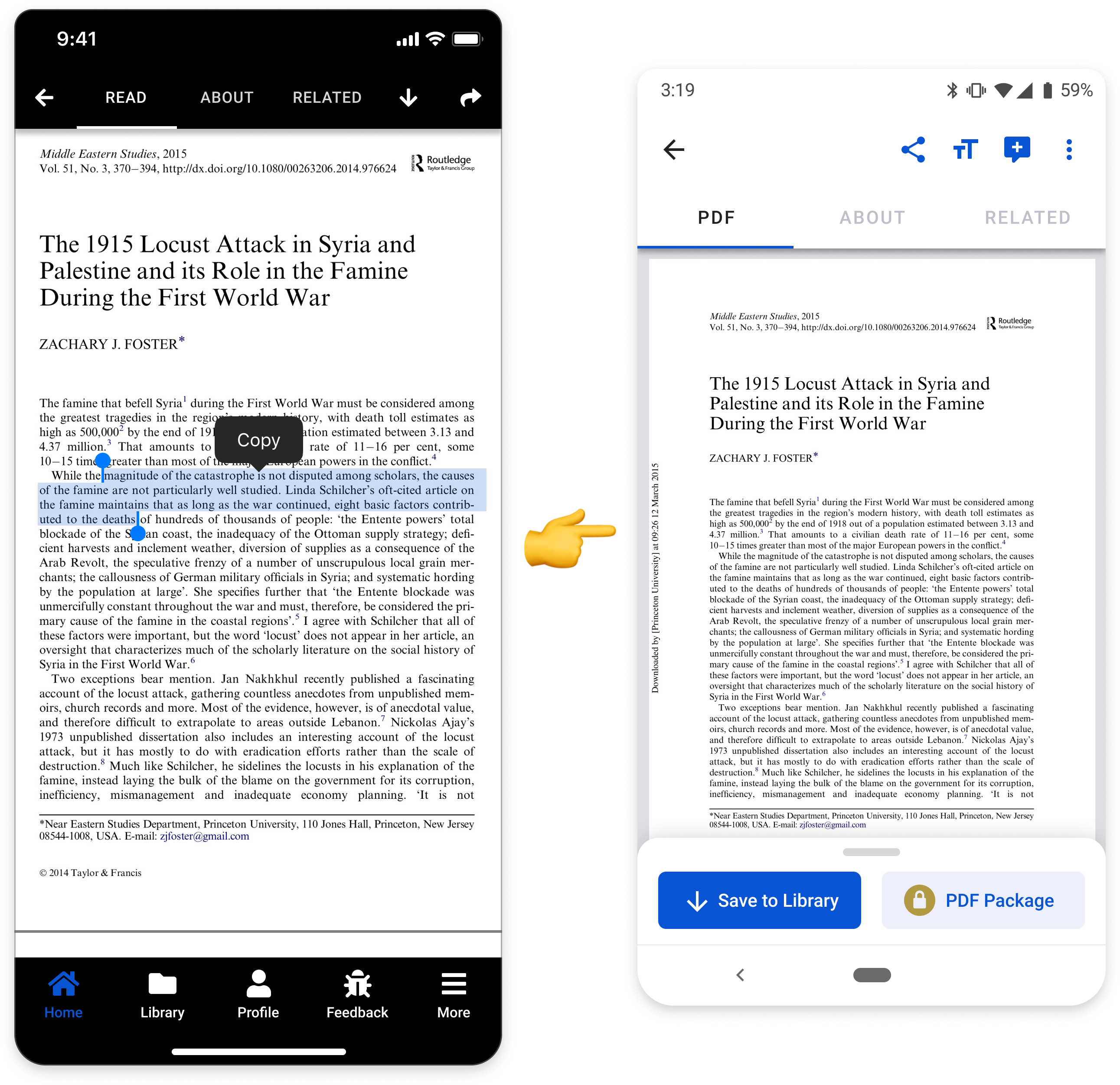
When we originally launched the iOS version of the Academia mobile app, it was done in the leanest way possible. Later, we came back to this page to make it more accessible, more in line with the most common users' journeys, & better optimized for the addition of subscription services.
Additionally, the original UI was cramped and didn't allow for the best experience as it contained mixed hierarchy, lack of scalability, accessibility issues, and general usability problems.
Team Composition
2 Android Engineers
2 iOS Engineers
1 Product Manager
1 Engineering Manager
1 Data Scientist
1 Product Designer
PAge data
1.12 million daily hits
40% of hits are mobile devices
Results
Accessibly designed mobile page
Better premium product visibility
User journey enhanced via search > paper feedback loops
50% of paper downloads resulting in further user exploration to drive user engagement & exposure to paid premium products
TEAM Goal
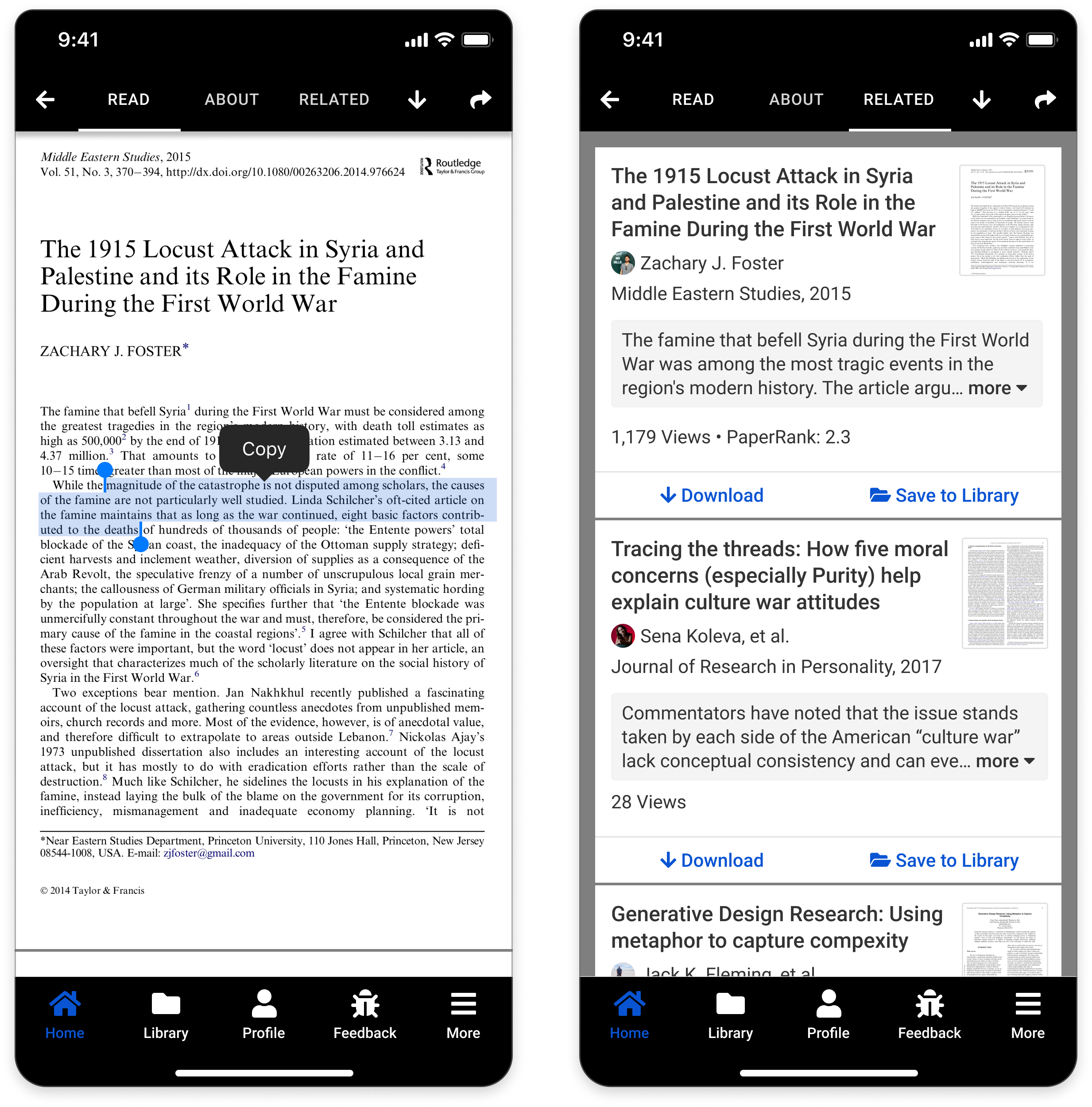
Team the very first MVP of Mobile Article Page to allow for reading, saving papers to device, adding 'about author' information, related papers, & sharing.
TEAM GOALS
Add premium products for revenue conversion
Fix accessibility issues
Unified a design system
Utilized mobile design principles
Maximized screen-real-estate for new potential products
In thinking about the features of the desktop experience, it was imperative that we focused on methodically distilling each of the existing functions of the page in a way that followed good mobile conventions while allowing for the scalability of content and future products for the business.
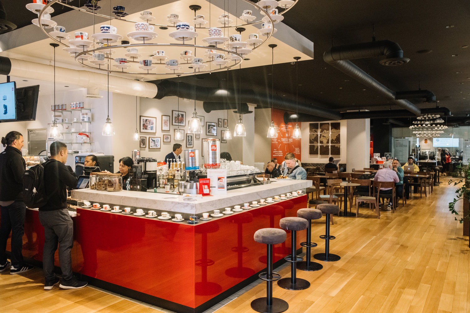
Usability testing…with gift cards
illy Caffè, 220 Montgomery
Equipped with a prototype from my engineers, I went downstairs to the nearest cafe and asked patrons to work through our prototype to uncover various gaps in the experience. This feedback was used to address core issues in the design and further refine what was needed for next step in interations.
50% of Drawer opens resulted in clicking on another article (feedback loops!)
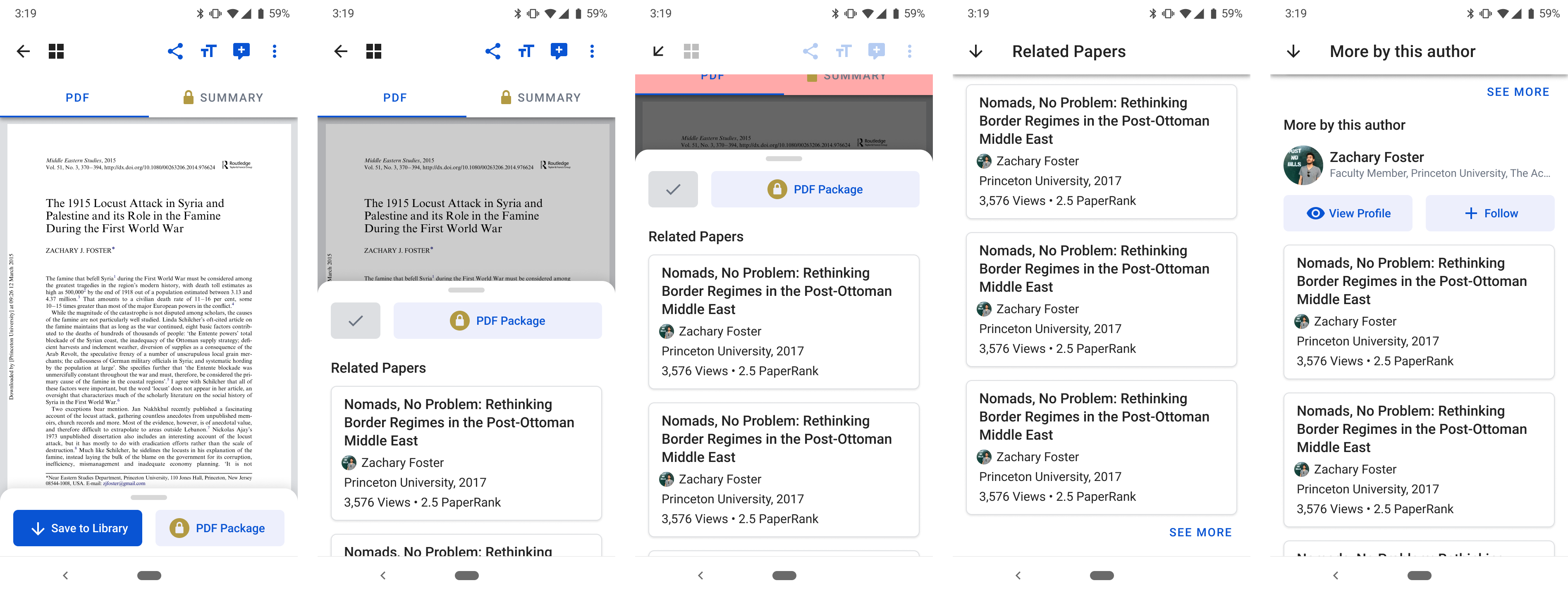
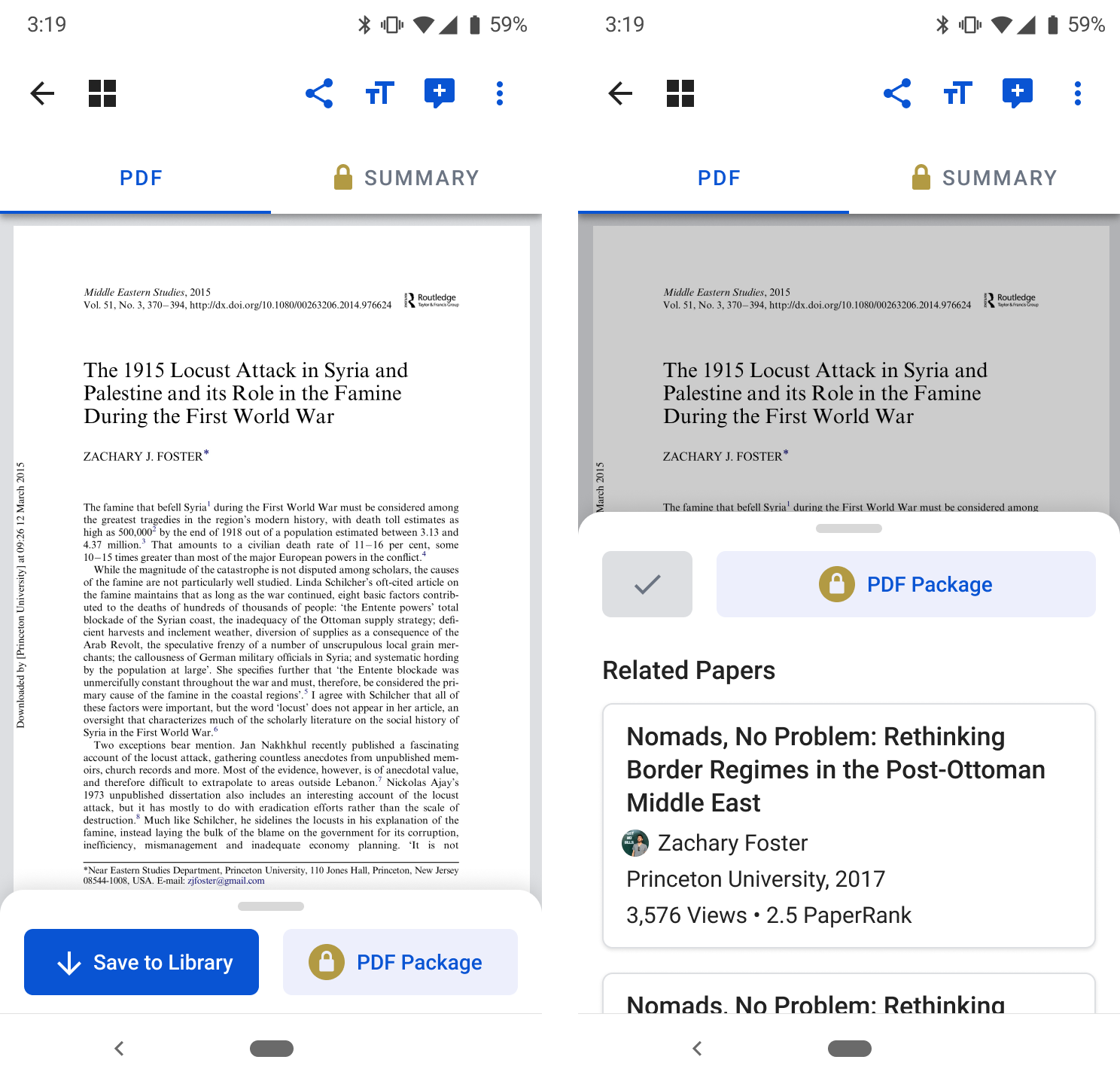
Detail of various drawer states of the mobile article page, mocks for engineering implementation. Note the usage of blue as an interaction affordance & addition of the gold lock for paid products.
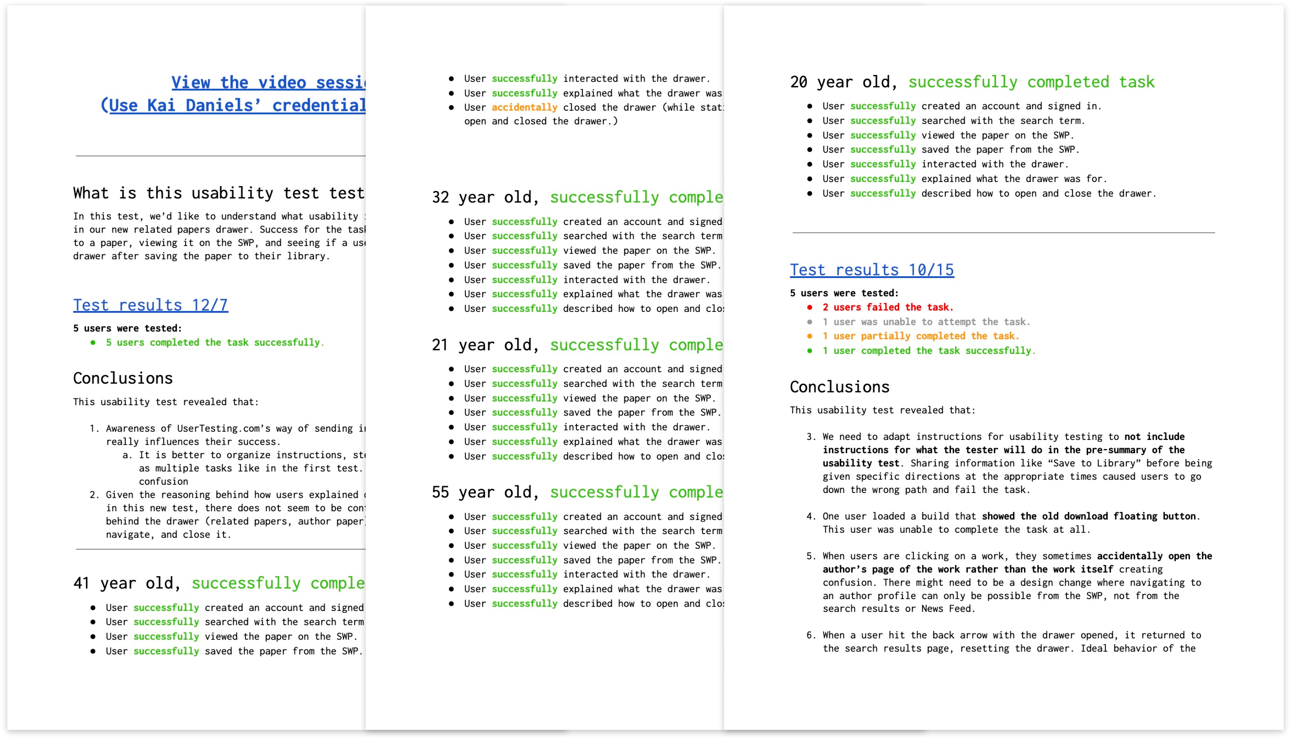
UserTesting.com was used to conduct this task analysis during the iteration process to ensure that designs could satisfy the team's goals.
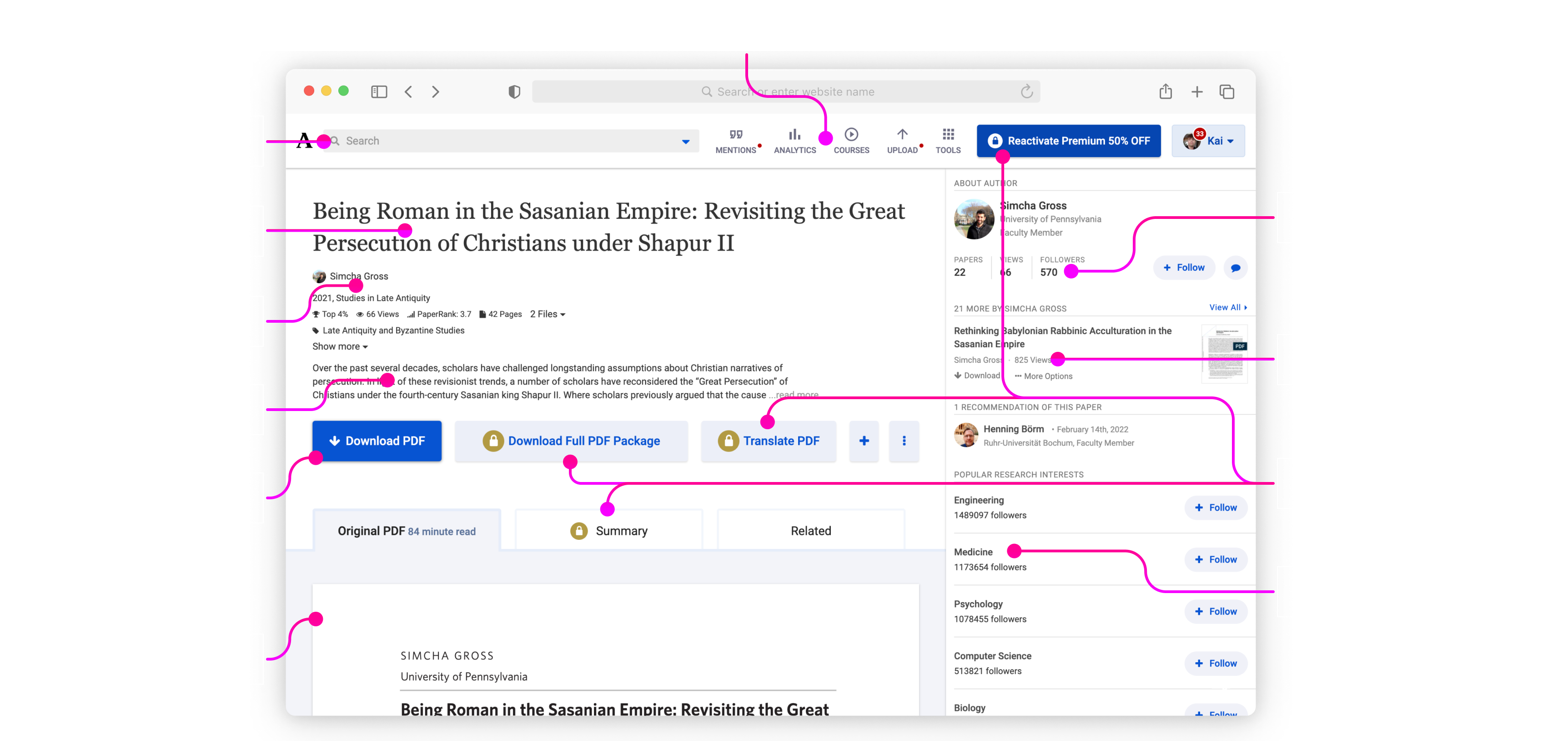
The visual & interaction design used in the redesign of this page was later extended back into the desktop experience, and became the foundation for what would become the Design System:
The startup environment can be extremely fast-paced. Speed is important—as is shipping products—but only so long as there is a plan for continuous improvement in thinking for the future.